
Postcode by Postcode Part 1: Where London House Prices Are Rising (and Falling)

To set the scene before diving into postcode-level insights, here are a few key stats on the London market overall — covered in more detail in my previous post here:
· 📈 London’s median price per square metre rose by just 1% in Q1 2025 compared to Q1 2024
· 🏡 Smaller, more affordable homes did much better — median price per square meter for properties under 50 sqm was up 9%
· 🏠 Meanwhile, larger and more expensive homes saw prices fall, with median price for properties over 100 sqm dropping 11%
Now for the Good Stuff — What’s Happening by Postcode?
This is where things really start to matter if you're buying or selling. While city-wide averages are useful, understanding what’s going on in specific areas gives you a real edge. This is part one of the analysis, focused on changes in price per square metre and the top and bottom performing postcodes. In part two, I’ll explore more maps covering price levels, number of transactions, and other key trends.
Before jumping into the data, a quick note on my approach: I don’t pretend to know exactly where prices are going — no one does. But I strongly believe that understanding how the market is behaving right now can make a big difference when it comes to negotiating, whether that's with agents, sellers, or lenders.
Also, I’ve excluded new-build developments from this analysis. There just aren’t many being sold at the moment, and when they do appear, they tend to distort the data — often creating awkward jumps that muddle the bigger picture.
Price Per Square Metre: Year-on-Year Change by Postcode
The map below shows how prices per square metre changed between Q1 2024 and Q1 2025, broken down by postcode.

As expected, some of the more affordable parts of East London are seeing strong growth, with a few postcodes up more than 10% year-on-year.
In contrast, much of West London is experiencing price declines. But one outlier stands out: W8 (Kensington). Despite already having some of the highest prices in London, W8 saw a 10%+ rise. It’s hard to pinpoint why, but one factor could be the sharp drop in sales volumes — from 78 in Q1 2024 to just 33 in Q1 2025. In expensive areas like this, a smaller number of high-value sales can easily skew the data.
📊 Top & Bottom 10 Postcodes – Price Change YoY (%)
I always find it helpful to zoom in on the top and bottom 10 postcodes, so I’ve pulled them out into two simple bar charts below.
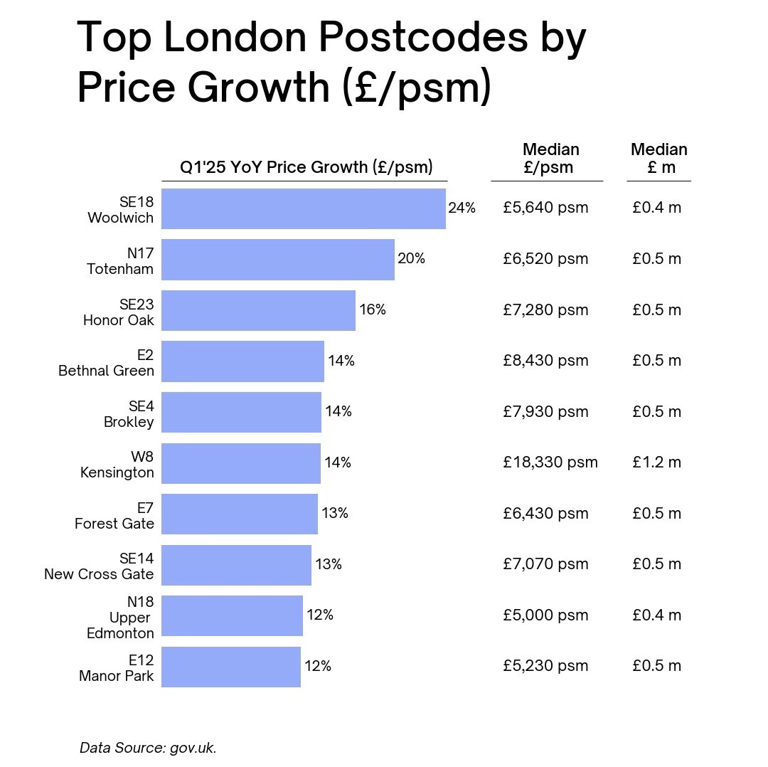

· 🥇 Top Performer: Woolwich (SE18) leads the pack with a 24% price increase
· 💡 Most top-performing postcodes were below the London median of £7,400 per sqm, with average home prices in the £400k–£500k range
On the flip side:
· 📉 Biggest Decliner: Bloomsbury (WC1) saw a 24% drop
· 🔻 Most of the worst-performing areas were well above the London average in price, reinforcing the pressure at the top of the market.
Final Takeaway
I’m not in the business of making bold predictions — but the trend is hard to miss. More affordable areas are attracting strong demand, while higher-priced postcodes are facing headwinds.
Stay tuned for part two, where I’ll break down the data further by transaction volumes, price brackets, and sales activity.
Got a question about your local area? Or want to see your postcode featured next time? Drop me a message — I’d love to hear from you.